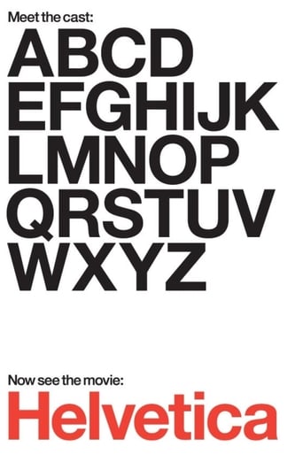
Helvetica (2007)
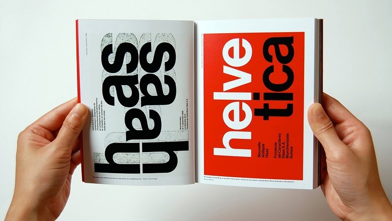
Helvetica is a feature-length independent film about typography, graphic design and global visual culture. It looks at the proliferation of one typeface (which will celebrate its 50th birthday in 2007) as part of a larger conversation about the way type affects our lives. The film is an exploration of urban spaces in major cities and the type that inhabits them, and a fluid discussion with renowned designers about their work, the creative process, and the choices and aesthetics behind their use of type.
Watch Trailer
Cast
Similar titles
Reviews
Please don't spend money on this.
People are voting emotionally.
Good start, but then it gets ruined
it is finally so absorbing because it plays like a lyrical road odyssey that’s also a detective story.
The maker wanted to so something new, something different. And it is so nice that the employer allowed this experiment. And that is about it.Maybe if the whole thing would have been 20-35 minutes long it would have been wonderful. But there is way too much space filler. So either that is bad planning by shooting too little or somebody was too attached to the footage that nothing could be dumped.Amusingly the story has no apparent structure, yet there is a clear and conventional ending. And the interviews seem to be thrown in as some of the speakers are against Helvetica usage, while most are in favor, but the selection criteria is not obvious to me.One argument this is plain bad work: there is a lot of talk of design, yet there are lots of pictures sliding in with logos written in Helvetica. This all looks like a silly advert from the 1980s. The purpose seems to be something along the lines of "you have to be initiated in order to see it".Still, I had a good laugh with the German designer calling the Swiss militarists (german joke, I know) and telling with a straight face how he is always late, one year late, but to the second.Bottom line: if you are curious about Helvetica and have two hours to waste, knock yourself out. Otherwise, this is a total waste of time.Contact me with Questions, Comments or Suggestions ryitfork @ bitmail.ch
I have some writing background in the music press. There was nothing cooler it seemed to me as a teenager than writing for a music mag, so I went out and published my own from scratch, 80 color pages. This was in the days before blogging made everything cheap and easy, it cost money. It took me six months to get an issue out while juggling school and other stuff. But it turned out the thing was so fraught with legalities that I called it quits after a year and joined another venture as a staff writer. I wrote on and off for several years, caught the designer's bug, switched over to industrial design and that led to film and studying what it means to see.Anyway, one of the very first decisions in that trade is choosing the typeface. It has to be smart but readable and preferably communicate some identity. I was mostly clueless at the time, a lot of Impact and Papyrus for headlines. But I was drawn to Arial for the body, Microsoft's rather tasteless clone of Helvetica.They're not lying when they say Helvetica is everywhere. Chances are something was advertised to you in Helvetica today. Hell, you're reading this in Helvetica. There's a reason for this. It is its own composed aesthetic, and for a lot of people, you are the context you have paid to buy together with the trinket.So here's a very neat idea for a documentary; a look into the forms we use to build the context, skin and identity of our world.The guy responsible for this gets more in the way than illuminates. He spreads rather than delves, main concerns being generally about visual culture. We get various points of view, some of them insightful, some superficial.But another angle to consider is this. We have this new radical typeface invented to do away with the clutter of history and reflect a modern world. It is clean, blends perfectly, fits every use, in fact it is so empty of an idiosyncratic self it becomes what it means, we're led to think. The exciting thing born from idealism is soon used to sell things, how it happens most of the time.So we have subsequent generations of designers who consciously revolt against the culture that has appropriated the form by revolting against the form itself. They value individualism and expression above meaning. When they're done by the early 90's, design is a jumbled heap of grunge, post-modern attitudes lying on the floor in meaningless pieces - this is where I found it.But there is an old Dutch guy from that school of modernists that were creative at around the same time as Antonioni and others. It is not about the symmetry of form, he says, it is how you handle intermediate space, the emptiness around the thing. The breath of air that holds it together - aspiring filmmakers should take notice.Herzog could spin this more powerfully to be about the emptiness behind the signs we devise to navigate the world, designed to reflect being and order, beauty out of chaos, probably via eccentricity.Perhaps the typeface itself reveals as much. The tremendous success of Helvetica is a form that has been shaped to give the impression that it has sprung naturally from the sign. It eludes by the anonymity of pure function. Selflessness is its beauty.Forget that you now see it in airline signs. The original ideal was something that reflects the author. On a whole other level, it's the same principle that guides Zen calligraphy.
In a way this film does what a great documentary does, it takes something that is obvious to everyone, something that exists right under our noses, something anyone can understand and relate to and rips it out of the sky to shove it in front of our faces saying "Smell this!" Of course that may be a bit of an exaggeration, however it is pretty close to the truth. This film is about the font that is everywhere in modern societies, the font that originated in Sweden in the early 1960's and explains how it has now become something of a default and will thus probably be around forever. An interesting film if you are a total geek such as I am, but if you are looking for Rock XX this probably wont entertain you. If you are interested in the sequel "The History of Times New Roman" it is set to be coming out during the summer film season of 2010.
Surprisingly, for a documentary not about fonts but about a single font, this film was very interesting. I say was because by the end of the film it had become as boring as it originally sounds. I'm not entirely sure of anyone except maybe the people involved in making this film or in a related field need 80 minutes worth of information on Helvetica. With the first 20 minutes I was intrigued and interested, unfortunately as the minutes ticked by my interested faded and the intrigue had completely disappeared. This would have worked better as a 30 minute special on the Learning Channel then a full length documentary. Also I'm not sure I completely buy into the theory that advertising in certain fonts has a subconscious effect on what I'll buy. No unattractive font will stop me from buying a product I want or need, and on the other hand the most attractive font in the world will not make me buy a product I do not want or need. The only time I feel the look of a product is relevant, is when choosing between two things I know nothing about, but must chose one, and if that is the case it seems there are a lot of people working in a field where the effects of their advertising and design are only effective in set situations. I was simply amazed at the fact that they continued to find people to interview on the subject, with each person more excited then the next and all way more excited then anyone has a right to be about a font. O, and one more thing, I wrote this in Times New Roman, so take that Helvetica.

